
Color Scheme
Customize color scheme, adaptive dark mode, and global color presets.
These settings apply to the whole site, so a change here is visible on every page that uses the feature. Find them under Canvas > Theme Options, in the Color Scheme tab.
The tab sits in the rail on the left of the screen, with its own panel beside it:
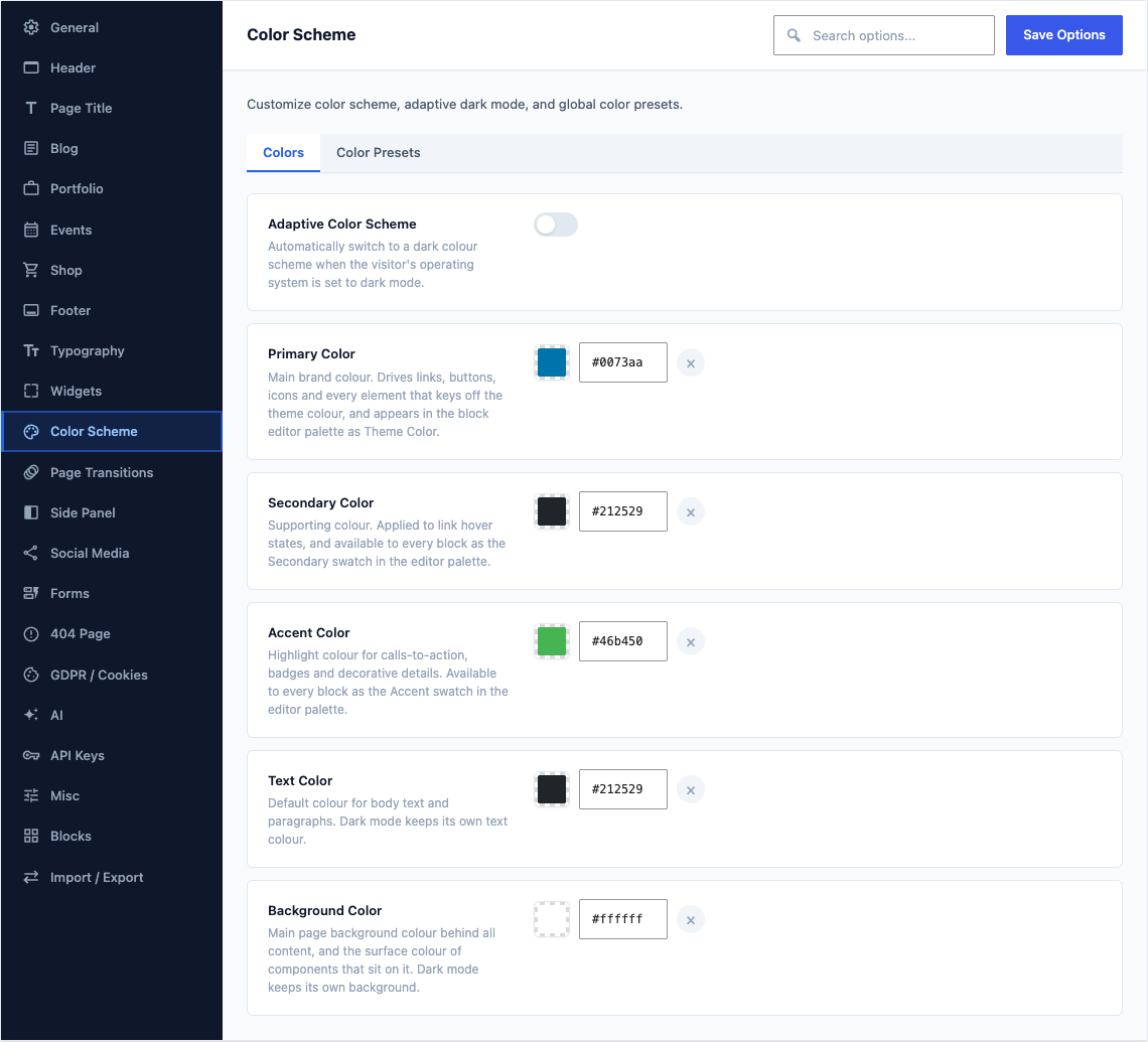
Colors
This group holds the following settings:
Adaptive Color SchemeDefaultOff
Automatically switch to a dark colour scheme when the visitor's operating system is set to dark mode.
Primary ColorDefault
#1abc9cMain brand colour. Drives links, buttons, icons and every element that keys off the theme colour, and appears in the block editor palette as Theme Color.
Secondary ColorDefault
#212529Supporting colour. Applied to link hover states, and available to every block as the Secondary swatch in the editor palette.
Accent ColorDefault
#46b450Highlight colour for calls-to-action, badges and decorative details. Available to every block as the Accent swatch in the editor palette.
Text ColorDefault
#212529Default colour for body text and paragraphs. Dark mode keeps its own text colour.
Background ColorDefault
#ffffffMain page background colour behind all content, and the surface colour of components that sit on it. Dark mode keeps its own background.
Color Presets
This group holds the following settings:
Custom Color PresetsDefaultEmpty
Define reusable color presets available across Canvas blocks and theme components. These supplement the default Bootstrap color classes (Primary, Success, Danger, etc.).
Gradient PresetsDefaulta preset list of 20 rows
Manage gradient presets. The 20 built-in Canvas gradients are pre-loaded below. You can modify them or add new custom gradients. Each gradient requires a direction and at least two color stops.