
Misc
Miscellaneous theme settings including maintenance mode and coming soon page.
These settings apply to the whole site, so a change here is visible on every page that uses the feature. Find them under Canvas > Theme Options, in the Misc tab.
The tab sits in the rail on the left of the screen, with its own panel beside it:
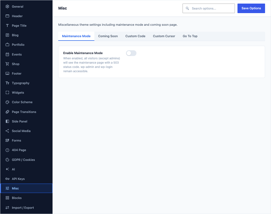
Maintenance Mode
This group holds the following settings:
Enable Maintenance ModeDefaultOff
When enabled, all visitors (except admins) will see the maintenance page with a 503 status code. wp-admin and wp-login remain accessible.
TitleDefault
Site is Under MaintenanceMain heading displayed on the maintenance page.
Shown when Enable Maintenance Mode is on
SubtitleDefault
Please check back in sometime.Secondary text displayed below the title.
Shown when Enable Maintenance Mode is on
Show LogoDefaultOn
Display the site logo in a transparent header at the top of the maintenance page.
Shown when Enable Maintenance Mode is on
Box 1 IconDefault
bi-exclamation-diamond-fillIcon above the first of the three boxes on the maintenance page. Pick one that matches what the box explains.
Shown when Enable Maintenance Mode is on
Box 1 TitleDefault
Why is the Site Down?Heading of the first box on the maintenance page. It states the question the box answers, which by default is why the site is down.
Shown when Enable Maintenance Mode is on
Box 1 TextDefault
The site is under maintenance probably because we are working to improve this website drastically.Body copy inside the first box. Keep it to a sentence or two, since visitors are here only to find out what happened.
Shown when Enable Maintenance Mode is on
Box 2 IconDefault
bi-clockIcon above the middle box on the maintenance page. A clock face suits the box that tells visitors how long the work will take.
Shown when Enable Maintenance Mode is on
Box 2 TitleDefault
What is the Downtime?Heading of the middle box, which by default asks how long the site will be unavailable.
Shown when Enable Maintenance Mode is on
Box 2 TextDefault
We are usually back within 10-15 minutes but it definitely depends on the issue.Body copy inside the middle box. Give a realistic idea of when to come back, because a vague answer sends visitors away for good.
Shown when Enable Maintenance Mode is on
Box 3 IconDefault
fa-envelopeIcon above the last box on the maintenance page, which is the box that carries your support email.
Shown when Enable Maintenance Mode is on
Box 3 TitleDefault
Do you need Support?Heading of the last box, the one that points visitors at a way to reach you while the site is down.
Shown when Enable Maintenance Mode is on
Box 3 TextDefault
You may simply send us an Email if you need urgent support.Body copy inside the last box. Say when it is worth contacting you rather than waiting, so urgent enquiries still reach you.
Shown when Enable Maintenance Mode is on
Support EmailDefaultEmpty
Email address displayed as a clickable link in the support box. Leave empty to hide.
Shown when Enable Maintenance Mode is on
Retry-After (seconds)Default
3600Value for the HTTP Retry-After header. Tells search engines when to check back. Default: 3600 (1 hour).
Shown when Enable Maintenance Mode is on
Coming Soon
This group holds the following settings:
Enable Coming Soon ModeDefaultOff
When enabled, all visitors (except admins) will see the coming soon page with a 503 status code. If maintenance mode is also enabled, it takes priority.
LayoutDefaultStandard
Choose the coming soon page style.
ChoicesStandardFullscreen BackgroundRegistration FormShown when Enable Coming Soon Mode is on
TitleDefault
We are currently Under ConstructionMain heading displayed on the coming soon page.
Shown when Enable Coming Soon Mode is on
SubtitleDefault
Please check back again within Some Days as We're Pretty CloseSecondary text displayed below the title.
Shown when Enable Coming Soon Mode is on
Show LogoDefaultOn
Display the site logo in the header area.
Shown when Enable Coming Soon Mode is on
Countdown DateDefaultEmpty
Target date for the countdown timer in YYYY-MM-DD format. Leave empty to hide the countdown. Available in Standard and Fullscreen layouts.
Shown when Enable Coming Soon Mode is on and Layout is not "Registration Form"
Show Progress BarDefaultOn
Display an animated striped progress bar. Standard layout only.
Shown when Enable Coming Soon Mode is on and Layout is "Standard"
Progress Value (%)Default
80Percentage value for the progress bar (0 to 100).
Shown when Enable Coming Soon Mode is on and Show Progress Bar is on
Progress Bar ColorDefaultRed
Fill colour of the progress bar on the coming soon page. Choose one that stands out against your background without reading as an error.
ChoicesRedBlueGreenYellowCyanDarkShown when Enable Coming Soon Mode is on and Show Progress Bar is on
Show Newsletter FormDefaultOn
Display an email subscription form. Available in Standard and Fullscreen layouts.
Shown when Enable Coming Soon Mode is on and Layout is not "Registration Form"
Newsletter Form Action URLDefaultEmpty
The form action URL for your email service (e.g. Mailchimp, ConvertKit). Leave empty if handled by JavaScript.
Shown when Enable Coming Soon Mode is on and Show Newsletter Form is on
Email PlaceholderDefault
Enter your EmailGrey prompt inside the empty email box on the subscription form. It disappears as soon as a visitor starts typing, so keep it short.
Shown when Enable Coming Soon Mode is on and Show Newsletter Form is on
Subscribe Button TextDefault
Subscribe NowWording on the button that submits the subscription form. Name what the visitor gets, such as Notify Me at Launch.
Shown when Enable Coming Soon Mode is on and Show Newsletter Form is on
Background TypeDefaultImage
Choose between a static image or autoplay video background. Fullscreen layout only.
ChoicesImageVideoShown when Enable Coming Soon Mode is on and Layout is "Fullscreen Background"
Background ImageDefaultEmpty
Background image for Fullscreen (image type) and Form layouts.
Shown when Enable Coming Soon Mode is on and Layout is not "Standard"
Video URL (MP4)DefaultEmpty
URL to an MP4 video file for the background.
Shown when Enable Coming Soon Mode is on and Layout is "Fullscreen Background" and Background Type is "Video"
Video URL (WebM)DefaultEmpty
Optional WebM fallback for broader browser support.
Shown when Enable Coming Soon Mode is on and Layout is "Fullscreen Background" and Background Type is "Video"
Video OverlayDefaultOn
Add a dark overlay on top of the video background for better text readability. Fullscreen video layout only.
Shown when Enable Coming Soon Mode is on and Layout is "Fullscreen Background"
Form Action URLDefaultEmpty
The form submission endpoint for the registration form. Leave empty if handled by JavaScript.
Shown when Enable Coming Soon Mode is on and Layout is "Registration Form"
Form Button TextDefault
Get NotifiedWording on the button that submits the registration form. Name the outcome, such as Get Notified or Join the List.
Shown when Enable Coming Soon Mode is on and Layout is "Registration Form"
Footer Copyright TextDefaultEmpty
Copyright text displayed in the footer. HTML allowed. Standard layout only.
Shown when Enable Coming Soon Mode is on and Layout is "Standard"
Contact EmailDefaultEmpty
Displayed in the top bar (Standard) or as a header contact button (Fullscreen).
Shown when Enable Coming Soon Mode is on and Layout is not "Registration Form"
Contact PhoneDefaultEmpty
Phone number displayed in the top bar and footer. Standard layout only.
Shown when Enable Coming Soon Mode is on and Layout is "Standard"
Retry-After (seconds)Default
3600Value for the HTTP Retry-After header. Tells search engines when to check back. Default: 3600 (1 hour).
Shown when Enable Coming Soon Mode is on
Custom Code
This group holds the following settings:
Custom CSSDefaultEmpty
Style rules added to the head of every page on the site, which is the safe place for small visual tweaks because they survive a theme update. Paste the rules on their own, with no surrounding style tag.
Custom JS - HeadDefaultEmpty
Code added to the head of every page, which is where analytics and tracking snippets need to run so they see the whole visit. Paste the code on its own, with no surrounding script tag.
Custom JS - FooterDefaultEmpty
Code added at the very end of every page, which is where chat widgets and anything that should wait for the content belong so the page still paints quickly. Paste the code on its own, with no surrounding script tag.
Custom Cursor
This group is part of Canvas Premium.
This group holds the following settings:
Enable Custom CursorDefaultOff
Replace the default browser cursor with a custom animated cursor. The cursor shows a small dot with a larger follower circle that reacts to links and buttons.
Cursor StyleDefaultFilled
Choose how the cursor follower circle is rendered.
ChoicesFilledBorder (hollow)Shown when Enable Custom Cursor is on
Cursor ColorDefaultEmpty
Color of the cursor follower and dot. Leave empty to use the theme accent color.
Shown when Enable Custom Cursor is on
Cursor SizeDefaultEmpty
Diameter of the small circle that trails the pointer, written as a length such as 0.75rem or 12px. Leave empty for the default of 0.75rem.
Shown when Enable Custom Cursor is on
Cursor OpacityDefaultEmpty
Opacity of the follower circle (0 to 1). Default: 0.15.
Shown when Enable Custom Cursor is on
Hover ColorDefaultEmpty
Color when hovering over links and buttons. Leave empty to use the theme accent color.
Shown when Enable Custom Cursor is on
Hover SizeDefaultEmpty
Diameter the trailing circle grows to over a link or button. A larger value makes the hover more obvious. Written as a length such as 4rem or 64px, and empty falls back to 4rem.
Shown when Enable Custom Cursor is on
Hover OpacityDefaultEmpty
Opacity of the follower when hovering (0 to 1). Default: 0.35.
Shown when Enable Custom Cursor is on
Hide on MobileDefaultOn
Disable the custom cursor on touch devices (phones, tablets) and restore the native cursor.
Shown when Enable Custom Cursor is on
Go To Top
This group holds the following settings:
Enable Go To Top ButtonDefaultOn
Display a floating button that scrolls the page to the top when clicked.
Button StyleDefaultArrow
Arrow shows the icon chosen below. Progress Ring replaces it with a circular ring; the active design supplies the ring's colour and thickness.
ChoicesArrowProgress RingShown when Enable Go To Top Button is on
Button IconDefault
uil-angle-upChoose the icon displayed inside the Go To Top button.
Shown when Enable Go To Top Button is on and Button Style is "Arrow"
Button ImageDefaultEmpty
Use a picture instead of the icon above, for a mark that belongs to the design rather than an icon set. Sized by Icon Size.
Shown when Enable Go To Top Button is on and Button Style is "Arrow"
Scroll Speed (ms)Default
700Duration of the scroll-to-top animation in milliseconds.
Shown when Enable Go To Top Button is on
Scroll Offset (px)Default
450How far the user must scroll (in pixels) before the button appears.
Shown when Enable Go To Top Button is on
Show on MobileDefaultOff
Display the Go To Top button on mobile and tablet devices. Disabled by default to save screen space.
Shown when Enable Go To Top Button is on
Button SizeDefaultEmpty
Width and height of the back-to-top button, written as a length such as 3rem or 48px. Leave empty for the default of 2.5rem.
Shown when Enable Go To Top Button is on
Background ColorDefaultEmpty
Button background color. Leave empty for default.
Shown when Enable Go To Top Button is on
Icon ColorDefaultEmpty
Color of the icon inside the button. Leave empty for default (white).
Shown when Enable Go To Top Button is on
Icon SizeDefaultEmpty
Size of the arrow drawn inside the back-to-top button, written as a length such as 1.5rem or 20px. Leave empty for the default of 1.5rem.
Shown when Enable Go To Top Button is on
Hover Background ColorDefaultEmpty
Background color on hover. Leave empty for theme accent color.
Shown when Enable Go To Top Button is on
Border RadiusDefaultEmpty
How rounded the corners of the back-to-top button are. Use 50% for a circle, a length such as 8px for softened corners, or 0 for a square. Leave empty for the default of 2px.
Shown when Enable Go To Top Button is on
Right OffsetDefaultEmpty
Gap between the back-to-top button and the right edge of the screen, written as a length such as 30px or 2rem. Increase it when the button sits under a chat widget. Leave empty for the default of 30px.
Shown when Enable Go To Top Button is on
Bottom OffsetDefaultEmpty
Gap between the back-to-top button and the bottom edge of the screen, written as a length such as 50px or 3rem. Leave empty for the default of 50px.
Shown when Enable Go To Top Button is on