
Page Title
Configure the page title banner displayed below the header on every page.
These settings apply to the whole site, so a change here is visible on every page that uses the feature. Find them under Canvas > Theme Options, in the Page Title tab.
The tab sits in the rail on the left of the screen, with its own panel beside it:
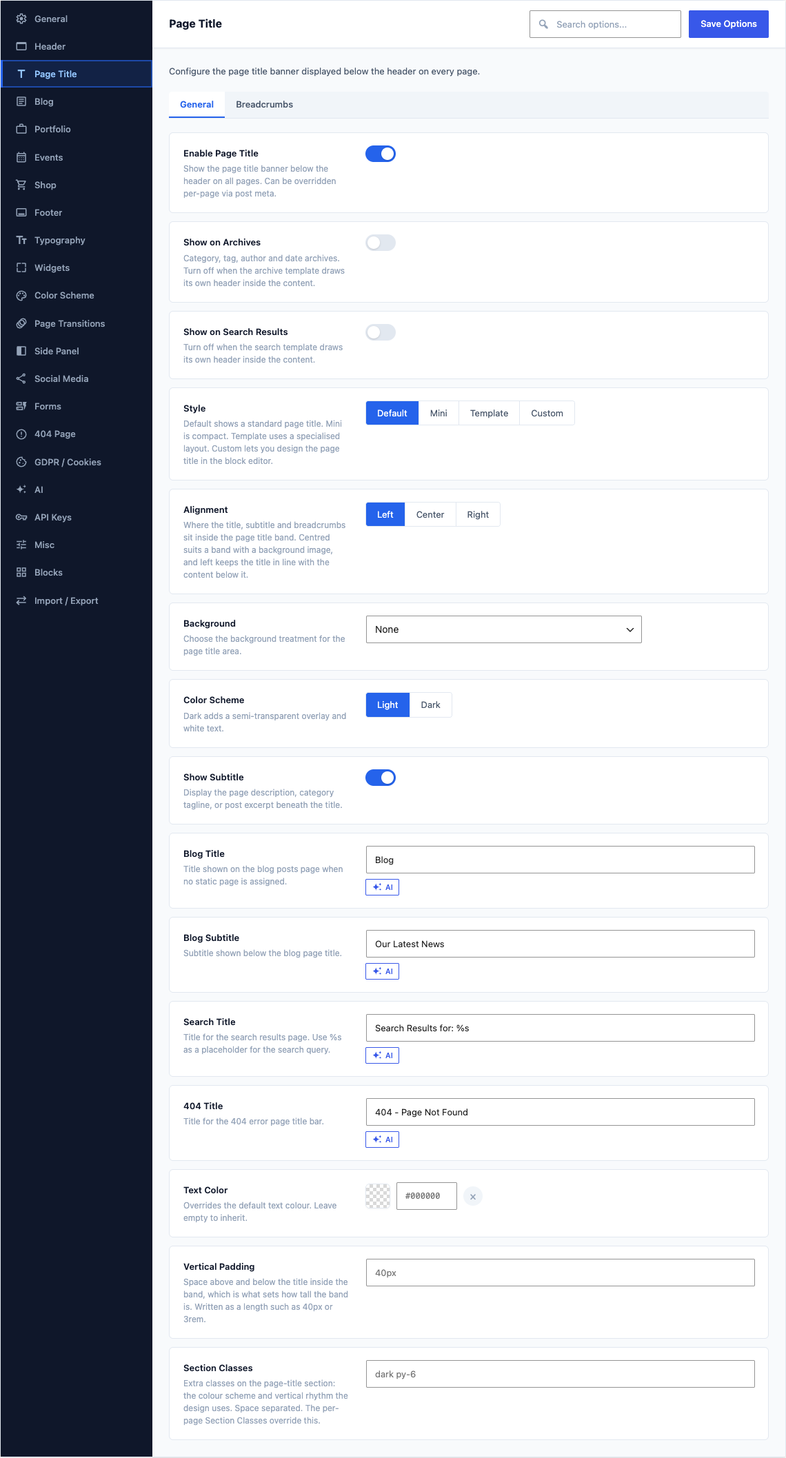
General
This group holds the following settings:
Enable Page TitleDefaultOn
Show the page title banner below the header on all pages. Can be overridden per-page via post meta.
Show on ArchivesDefaultOn
Category, tag, author and date archives. Turn off when the archive template draws its own header inside the content.
Shown when Enable Page Title is on
Show on Search ResultsDefaultOn
Turn off when the search template draws its own header inside the content.
Shown when Enable Page Title is on
StyleDefaultDefault
Default shows a standard page title. Mini is compact. Template uses a specialised layout. Custom lets you design the page title in the block editor.
ChoicesDefaultMiniTemplateCustomShown when Enable Page Title is on
TemplateDefaultBold
Choose a specialised page title layout.
ChoicesNone (empty)BoldFeaturedBlogShopBoxesGoogle MapsShown when Enable Page Title is on and Style is "Template"
Custom Page Title TemplateDefaultEmpty
Select a block-designed page title template.Manage Page Titles
Choices- Select Page Title - (empty)Page Title #1Shown when Enable Page Title is on and Style is "Custom"
AlignmentDefaultLeft
Where the title, subtitle and breadcrumbs sit inside the page title band. Centred suits a band with a background image, and left keeps the title in line with the content below it.
ChoicesLeftCenterRightShown when Enable Page Title is on and Style is "Default" or "Mini"
BackgroundDefaultNone
Choose the background treatment for the page title area.
ChoicesTheme BarNoneColorStatic ImageParallaxPatternVideoShown when Enable Page Title is on and Style is "Default"
Include HeaderDefaultOff
Extend the page title area behind the header for a full-bleed effect. Choose Transparent Header from Header Settings when using this option.
Shown when Enable Page Title is on and Style is "Default" and Background is "Static Image" or "Parallax" or "Pattern" or "Video"
Color SchemeDefaultLight
Dark adds a semi-transparent overlay and white text.
ChoicesLightDarkShown when Enable Page Title is on and Style is not "Custom"
Show SubtitleDefaultOn
Display the page description, category tagline, or post excerpt beneath the title.
Shown when Enable Page Title is on and Style is not "Custom"
Blog TitleDefault
BlogTitle shown on the blog posts page when no static page is assigned.
Shown when Enable Page Title is on and Style is not "Custom"
Blog SubtitleDefault
Our Latest NewsSubtitle shown below the blog page title.
Shown when Enable Page Title is on and Style is not "Custom" and Show Subtitle is on
Search TitleDefault
Search Results for: %sTitle for the search results page. Use %s as a placeholder for the search query.
Shown when Enable Page Title is on and Style is not "Custom"
404 TitleDefault
404 - Page Not FoundTitle for the 404 error page title bar.
Shown when Enable Page Title is on and Style is not "Custom"
Background ColorDefaultEmpty
Fill behind the page title band. A tone slightly off your page background is enough to mark the band as a separate strip.
Shown when Enable Page Title is on and Style is "Default" and Background is "Color"
Background ImageDefaultEmpty
Recommended minimum width: 1400 px.
Shown when Enable Page Title is on and Style is "Default" and Background is "Static Image" or "Parallax" or "Pattern"
Background Image CSSDefaultEmpty
Style declarations applied to the background image layer, for example height: 120%; top: -15%; to oversize and shift a photograph so the interesting part lands inside the band. A single page can override this from its own Page Title settings.
Shown when Enable Page Title is on and Style is "Default" and Background is "Static Image" or "Parallax" or "Pattern"
Image OverlayDefaultEmpty
Colour or gradient painted over the background image so light text stays legible. Leave empty for no overlay. The per-page Image Overlay overrides this.
Shown when Enable Page Title is on and Style is "Default" and Background is "Static Image" or "Parallax" or "Pattern"
Text ColorDefaultEmpty
Overrides the default text colour. Leave empty to inherit.
Shown when Enable Page Title is on and Style is not "Custom"
Vertical PaddingDefaultEmpty
Space above and below the title inside the band, which is what sets how tall the band is. Written as a length such as 40px or 3rem.
Shown when Enable Page Title is on and Style is not "Custom"
Section ClassesDefaultEmpty
Extra classes on the page-title section: the colour scheme and vertical rhythm the design uses. Space separated. The per-page Section Classes override this.
Shown when Enable Page Title is on
Video SourceDefaultUpload
Where the background video comes from. Upload picks a file from your media library, while URL points at a file hosted elsewhere and keeps it off your own hosting.
ChoicesUploadURLShown when Enable Page Title is on and Style is "Default" and Background is "Video"
Video FileDefaultEmpty
Upload an MP4 video from the media library.
Shown when Enable Page Title is on and Style is "Default" and Background is "Video" and Video Source is "Upload"
Video URLDefaultEmpty
URL to an MP4 video file for the video background.
Shown when Enable Page Title is on and Style is "Default" and Background is "Video" and Video Source is "URL"
Video Poster ImageDefaultEmpty
Fallback image shown while the video loads.
Shown when Enable Page Title is on and Style is "Default" and Background is "Video"
Overlay OpacityDefault
0.6Dark overlay opacity. Value between 0 (transparent) and 1 (opaque).
Shown when Enable Page Title is on and Style is "Default" and Background is "Video"
Badge TextDefaultEmpty
Optional pill badge displayed above the title.
Shown when Enable Page Title is on and Template is "Featured" or "Boxes"
Primary CTA TextDefaultEmpty
Wording on the main button in the page title band. Name the one action you most want visitors to take. The button is hidden while this is empty.
Shown when Enable Page Title is on and Template is "Featured"
Primary CTA URLDefaultEmpty
Where the main button in the page title band sends visitors. Paste a full web address, or use an anchor such as #contact to jump down the current page.
Shown when Enable Page Title is on and Template is "Featured"
Secondary CTA TextDefaultEmpty
Wording on the second, quieter button beside the main one. Use it for the lower-commitment option, such as reading more before getting in touch. The button is hidden while this is empty.
Shown when Enable Page Title is on and Template is "Featured"
Secondary CTA URLDefaultEmpty
Where the second button in the page title band sends visitors. Paste a full web address, or use an anchor to jump down the current page.
Shown when Enable Page Title is on and Template is "Featured"
Google Maps AddressDefaultEmpty
Location the map behind the page title centres on, written the way you would type it into a search box. The map is hidden while this is empty.
Shown when Enable Page Title is on and Template is "Google Maps"
Google Maps ZoomDefault
14Zoom level for the map (1-20). Default: 14.
Shown when Enable Page Title is on and Template is "Google Maps"
Breadcrumbs
This group holds the following settings:
Enable BreadcrumbsDefaultOn
Display a breadcrumb navigation trail in the page title area. Does not apply when Style is set to Custom.
Shown when Enable Page Title is on
PositionDefaultAfter the title
Where the breadcrumb trail sits inside the title row. The per-page Breadcrumbs Position overrides this.
ChoicesAfter the titleBefore the titleShown when Enable Page Title is on and Enable Breadcrumbs is on
SeparatorDefault/
Character displayed between breadcrumb items.
Choices/›»•CustomShown when Enable Page Title is on and Enable Breadcrumbs is on
Custom SeparatorDefaultEmpty
Enter a custom separator character or text.
Shown when Enable Page Title is on and Enable Breadcrumbs is on and Separator is "Custom"
Home LabelDefaultEmpty
Text for the Home breadcrumb link. Leave empty for the default "Home".
Shown when Enable Page Title is on and Enable Breadcrumbs is on
Show Home IconDefaultOn
Replace the Home text with a home icon. Screen readers will still see the text label.
Shown when Enable Page Title is on and Enable Breadcrumbs is on
Home IconDefault
uil-homeChoose a custom icon for the Home breadcrumb item.
Shown when Enable Page Title is on and Enable Breadcrumbs is on and Show Home Icon is on
Show Current PageDefaultOn
Include the current page as the last (non-linked) breadcrumb item.
Shown when Enable Page Title is on and Enable Breadcrumbs is on
Show Blog PageDefaultOn
Include the Blog index page in the trail for single posts.
Shown when Enable Page Title is on and Enable Breadcrumbs is on
Show CategoryDefaultOn
Include the primary category in the trail for single posts.
Shown when Enable Page Title is on and Enable Breadcrumbs is on
Prefix TextDefaultEmpty
Optional text before the breadcrumb trail, e.g. "You are here:".
Shown when Enable Page Title is on and Enable Breadcrumbs is on
Max Title LengthDefault
0Truncate breadcrumb labels longer than this many characters. Set to 0 for no limit.
Shown when Enable Page Title is on and Enable Breadcrumbs is on
Hide on MobileDefaultOff
Hide the breadcrumb trail on screens below 768px.
Shown when Enable Page Title is on and Enable Breadcrumbs is on
Font SizeDefaultEmpty
Size of the breadcrumb trail, written as a length such as 13px or 0.875rem. Keep it smaller than the title so it reads as secondary navigation.
Shown when Enable Page Title is on and Enable Breadcrumbs is on
Font WeightDefaultEmpty
How heavy the breadcrumb trail is drawn. A lighter weight keeps it from competing with the page title above it.
ChoicesDefault (empty)Light (300)Normal (400)Medium (500)Semi-Bold (600)Bold (700)Shown when Enable Page Title is on and Enable Breadcrumbs is on
Text TransformDefaultEmpty
Letter casing applied to the breadcrumb trail on screen, whatever casing your page and category names use. Uppercase suits a small trail set in a wide band.
ChoicesNone (empty)UppercaseLowercaseCapitalizeShown when Enable Page Title is on and Enable Breadcrumbs is on
Text ColorDefaultEmpty
Color for breadcrumb text and the current item. Leave empty to inherit from page title.
Shown when Enable Page Title is on and Enable Breadcrumbs is on
Link ColorDefaultEmpty
Color for breadcrumb links. Leave empty to inherit.
Shown when Enable Page Title is on and Enable Breadcrumbs is on
Link Hover ColorDefaultEmpty
Colour a breadcrumb link turns when the pointer is over it, which is how visitors see that the step is clickable.
Shown when Enable Page Title is on and Enable Breadcrumbs is on
Active Item ColorDefaultEmpty
Color for the current (non-linked) breadcrumb.
Shown when Enable Page Title is on and Enable Breadcrumbs is on
Separator ColorDefaultEmpty
Colour of the character between one breadcrumb step and the next. Setting it lighter than the links keeps the trail easy to scan.
Shown when Enable Page Title is on and Enable Breadcrumbs is on
SpacingDefaultEmpty
Vertical margin around the breadcrumbs. e.g. 10px 0 or 0.5rem.
Shown when Enable Page Title is on and Enable Breadcrumbs is on
Schema MarkupDefaultOn
Output JSON-LD BreadcrumbList structured data for search engines.
Shown when Enable Page Title is on and Enable Breadcrumbs is on