
Header
Configure header appearance, layout, menus, and behavior.Manage Top Bars Manage Mega Menus
These settings apply to the whole site, so a change here is visible on every page that uses the feature. Find them under Canvas > Theme Options, in the Header tab.
The tab sits in the rail on the left of the screen, with its own panel beside it:
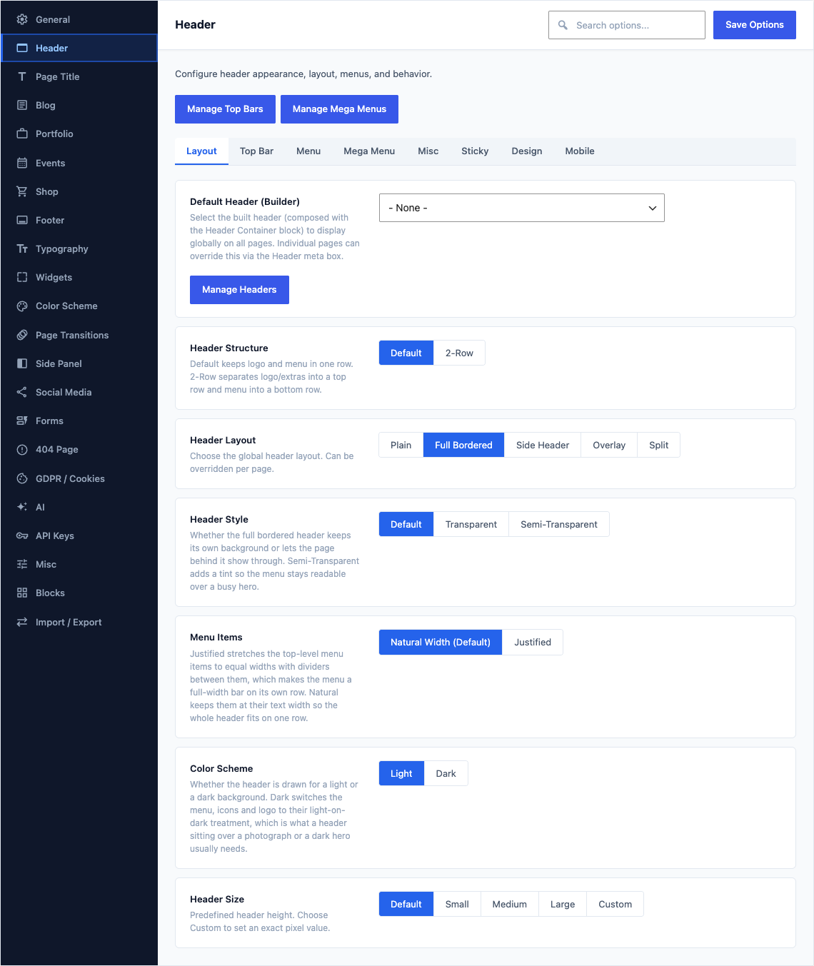
Layout
This group holds the following settings:
Default Header (Builder)DefaultEmpty
Select the built header (composed with the Header Container block) to display globally on all pages. Individual pages can override this via the Header meta box.Manage Headers
Choices- None - (empty)Canvas Main HeaderHeader Builder Bridge Fixture (Task 0.1)Headers Demo | Alternate Mobile MenuHeaders Demo | DirectoryHeaders Demo | Floating Semi-TransparentHeaders Demo | Floating SmallHeaders Demo | Full BorderHeaders Demo | Full MenuHeaders Demo | Logo ChangerHeaders Demo | Minimal EcommerceHeaders Demo | Off-Canvas Overlayand 23 more
Header StructureDefaultDefault
Default keeps logo and menu in one row. 2-Row separates logo/extras into a top row and menu into a bottom row.
ChoicesDefault2-Row
Header LayoutDefaultPlain
Choose the global header layout. Can be overridden per page.
ChoicesPlainFull BorderedSide HeaderOverlaySplitShown when Header Structure is "Default"
Header StyleDefaultDefault
How the header sits on the page. The transparent styles let a hero image or video show through behind the menu, and the floating styles lift the header off the top edge so it reads as a bar over the content.
ChoicesDefaultTransparentSemi-TransparentFloatingFloating Semi-TransparentShown when Header Structure is "Default" and Header Layout is "Plain"
Header StyleDefaultDefault
Whether the full bordered header keeps its own background or lets the page behind it show through. Semi-Transparent adds a tint so the menu stays readable over a busy hero.
ChoicesDefaultTransparentSemi-TransparentShown when Header Structure is "Default" and Header Layout is "Full Bordered"
Menu ItemsDefaultNatural Width (Default)
Justified stretches the top-level menu items to equal widths with dividers between them, which makes the menu a full-width bar on its own row. Natural keeps them at their text width so the whole header fits on one row.
ChoicesNatural Width (Default)JustifiedShown when Header Structure is "Default" and Header Layout is "Full Bordered"
Side Header PositionDefaultLeft
Which edge of the screen the vertical header panel is anchored to. Page content fills the space on the opposite side.
ChoicesLeftRightShown when Header Structure is "Default" and Header Layout is "Side Header"
Side Header BehaviorDefaultDefault
Default keeps the side panel on screen at all times. Open hides it behind a trigger button and slides it over the page when a visitor opens it, and Push does the same but moves the page across instead of covering it, which buys back the full page width.
ChoicesDefaultOpenPushShown when Header Structure is "Default" and Header Layout is "Side Header"
Side Header Closes on ScrollDefaultOff
The open side panel folds away as the visitor scrolls instead of staying open. Can be overridden per page.
Shown when Header Structure is "Default" and Header Layout is "Side Header" and Side Header Behavior is "Open" or "Push"
Container WidthDefaultBoxed
Choose the container style for the header content area.
ChoicesBoxedFull WidthShown when Header Layout is "Plain" and Header Style is not "Floating" or "Floating Semi-Transparent"
Color SchemeDefaultLight
Whether the header is drawn for a light or a dark background. Dark switches the menu, icons and logo to their light-on-dark treatment, which is what a header sitting over a photograph or a dark hero usually needs.
ChoicesLightDark
Header SizeDefaultDefault
Predefined header height. Choose Custom to set an exact pixel value.
ChoicesDefaultSmallMediumLargeCustom
Custom Header HeightDefaultEmpty
Exact height of the header bar, written as a length such as 80px or 5rem. Use it when none of the preset sizes lines up with your logo.
Shown when Header Size is "Custom"
Top Bar
This group holds the following settings:
Enable Top BarDefaultOff
Add a thin bar above the main header for announcements, contact info, or custom content.
Top Bar Content ModeDefaultDefault (Menu + Social + Contact)
Default shows a menu, social icons, and contact info. Or display a block-composed Top Bar, or simple text.
ChoicesDefault (Menu + Social + Contact)Built Top Bar (blocks)Simple Text / HTMLShown when Enable Top Bar is on
Default Top BarDefault
0Select the top bar to display globally. Compose top bars with blocks under Canvas → Top Bars.Manage Top Bars
Shown when Enable Top Bar is on and Top Bar Content Mode is "Built Top Bar (blocks)"
Top Bar TextDefaultEmpty
Text or HTML displayed inside the top bar. Supports links and inline styles.
Shown when Enable Top Bar is on and Top Bar Content Mode is "Simple Text / HTML"
Phone NumberDefaultEmpty
Displayed in the top bar with a phone icon. Leave empty to hide.
Shown when Enable Top Bar is on and Top Bar Content Mode is "Default (Menu + Social + Contact)"
Email AddressDefaultEmpty
Displayed in the top bar with an email icon. Leave empty to hide.
Shown when Enable Top Bar is on and Top Bar Content Mode is "Default (Menu + Social + Contact)"
Top Bar Color SchemeDefaultLight
Light or dark theme for the top bar area.
ChoicesLightDarkShown when Enable Top Bar is on
Top Bar Background ColorDefaultEmpty
Fill behind the top bar. Set it when you want the announcement strip to stand apart from the header below it. Leave empty to keep the colour that comes with the top bar scheme.
Shown when Enable Top Bar is on
Top Bar Text ColorDefaultEmpty
Colour of the text, links and icons inside the top bar. Set it alongside a custom background so the strip keeps enough contrast to read.
Shown when Enable Top Bar is on
Top Bar Bottom BorderDefaultEmpty
Rule drawn along the bottom edge of the top bar, written as thickness, style and colour, for example 1px solid #eee. Use it to separate the strip from the header below.
Shown when Enable Top Bar is on
Top Bar PaddingDefaultEmpty
Space inside the top bar, written as the vertical amount then the horizontal one, for example 8px 0. Raise the first value to make the strip taller.
Shown when Enable Top Bar is on
Menu
This group holds the following settings:
Menu AlignmentDefaultRight
Horizontal alignment of the primary navigation menu.
ChoicesLeftCenterRight
Dropdown ArrowsDefaultOn
Show small arrows on menu items that have sub-menus.
Dropdown TriggerDefaultHover
How sub-menus are triggered: hover or click.
ChoicesHoverClick
Menu Font SizeDefaultEmpty
Size of the top-level menu labels, written as a length such as 14px or 0.875rem. Lower it when a long menu is close to wrapping onto a second line.
Menu Font WeightDefaultEmpty
How heavy the top-level menu labels are drawn. Raise it when the menu looks faint against a busy header, and lower it for a lighter, more editorial navigation.
ChoicesDefault (empty)400 (Normal)500 (Medium)600 (Semi-Bold)700 (Bold)
Menu Text TransformDefaultEmpty
Letter casing applied to the top-level menu labels on screen, whatever casing the menu items were saved in. Uppercase gives the classic compact navigation look.
ChoicesDefault (empty)NoneUppercaseCapitalize
Menu Letter SpacingDefaultEmpty
Extra space between the letters of each menu label, written as a length such as 1px or 0.05em. A small positive value suits an uppercase menu.
Menu Link ColorDefaultEmpty
Colour of the top-level menu labels at rest. Set it when the header background is custom and the default link colour no longer reads clearly.
Menu Hover ColorDefaultEmpty
Colour a top-level menu label turns when the pointer is over it, which is how visitors confirm an item is clickable.
Menu Active ColorDefaultEmpty
Color for the currently active menu item.
Menu Item PaddingDefaultEmpty
Padding inside each top-level menu item, which is what sets the gap between one item and the next. A single length such as 15px changes the left and right sides only; two lengths such as 19px 15px set the vertical padding as well, which also fixes the height of the bar.
Submenu BackgroundDefaultEmpty
Fill behind a dropdown panel when a menu item opens. Change it to sit the dropdown on your own colour rather than the theme default.
Submenu Link ColorDefaultEmpty
Colour of the links inside a dropdown panel at rest. Set it to keep them readable against a custom submenu background.
Submenu Hover ColorDefaultEmpty
Colour a dropdown link turns when the pointer is over it, so visitors can see which row they are about to open.
Submenu Hover BackgroundDefaultEmpty
Fill behind a dropdown link while the pointer is over it. A soft tint here highlights the whole row rather than the text alone.
Submenu BorderDefaultEmpty
Rule drawn along the top edge of every dropdown and mega menu panel, written as thickness, style and colour, for example 1px solid #eee. It reads as a hairline joining the panel to the menu above it.
Mega Menu
This group holds the following settings:
Background ColorDefaultEmpty
Background color of the mega menu dropdown panel.
Box ShadowDefaultEmpty
CSS box-shadow value, e.g. "0 13px 42px 11px rgba(0,0,0,0.05)".
BorderDefaultEmpty
CSS border shorthand for the mega menu panel, e.g. "1px solid #eee".
Column PaddingDefaultEmpty
CSS padding for each mega menu column (Style-2 layout), e.g. "1.75rem 1.5rem".
Column Divider BorderDefaultEmpty
CSS border between mega menu columns, e.g. "1px solid #eee".
Compact Menu WidthDefaultEmpty
Width of the compact (small) mega menu dropdown, e.g. "400px".
Title Font SizeDefaultEmpty
Font size for mega menu column titles (Style-2), e.g. "14px" or "0.9rem".
Title Font WeightDefaultEmpty
How heavy the column headings in a mega menu panel look. Lighter weights suit a panel with many short links.
ChoicesDefault (700) (empty)400 (Normal)500 (Medium)600 (Semi-Bold)700 (Bold)800 (Extra-Bold)
Title Text TransformDefaultEmpty
Whether the column headings in a mega menu panel are shown in capitals, with each word capitalised, or exactly as they are typed.
ChoicesDefault (Uppercase) (empty)NoneUppercaseCapitalize
Title Letter SpacingDefaultEmpty
Letter spacing for mega menu column titles, e.g. "1px" or "0.05em".
Title ColorDefaultEmpty
Color for mega menu column titles (Style-2).
Title Hover ColorDefaultEmpty
Colour a mega menu column heading changes to while the pointer is over it.
Title Bottom SpacingDefaultEmpty
Margin below column titles, e.g. "0.5rem" or "10px".
Link PaddingDefaultEmpty
CSS padding shorthand for mega menu sub-links, e.g. "0.5rem 0.25rem".
Link Hover BackgroundDefaultEmpty
Background color when hovering over mega menu sub-links.
Link Hover Border RadiusDefaultEmpty
Border radius for link hover background, e.g. "0.25rem" or "4px".
Misc
This group holds the following settings:
Show Search IconDefaultOn
Display a search icon in the header navigation bar.
Show Shopping CartDefaultOn
Display the WooCommerce cart icon in the header. Requires WooCommerce to be active.
Show Side Panel TriggerDefaultOn
Display the side panel toggle button in the header. Requires Side Panel to be enabled.
Show CTA ButtonDefaultOff
Display a call-to-action button in the header.
CTA Button TextDefault
Get StartedWording on the header button. Name the action you want visitors to take, such as Book a Call or Get a Quote. The button is hidden while this is empty.
Shown when Show CTA Button is on
CTA Button URLDefault
#Where the header button sends visitors, usually your contact, booking or pricing page. Paste a full web address, or use an anchor such as #contact to jump down the current page.
Shown when Show CTA Button is on
CTA Button StyleDefaultPrimary
How much visual weight the header button carries. Primary is a solid fill in your main brand colour, Secondary is a quieter solid, and Outline is a border with no fill for headers that already sit over an image.
ChoicesPrimarySecondaryOutlineShown when Show CTA Button is on
CTA Open in New TabDefaultOff
Open the header button in a new browser tab so your site stays on screen behind it. Worth turning on when the button points at a booking system or another external service.
Shown when Show CTA Button is on
Show Social IconsDefaultOff
Display social media icons in the header. Uses links from Social Media settings.
Sticky
This group holds the following settings:
Enable Sticky HeaderDefaultOn
Keep the header visible as visitors scroll down the page.
Sticky BehaviorDefaultStatic Sticky
How the sticky header appears while scrolling.
ChoicesStatic StickyShow on Scroll UpShrink on ScrollShown when Enable Sticky Header is on
Shrink While StickyDefaultOn
On by default. Turn off to keep the header at its full height once it pins: a design whose header is a two-row masthead needs its full height on every view, archives included.
Shown when Enable Sticky Header is on
Sticky Header LogoDefaultEmpty
Optional alternate logo displayed when the header is in sticky state.
Shown when Enable Sticky Header is on
Sticky Header Logo - Retina (@2x)DefaultEmpty
High-resolution version of the sticky logo for Retina screens.
Shown when Enable Sticky Header is on and site_logo_retina_enable is on
Sticky Background ColorDefaultEmpty
Fill behind the header once it pins to the top of the screen. Set a solid colour here when the header starts out transparent, so the menu stays readable over the page scrolling beneath it.
Shown when Enable Sticky Header is on
Sticky Menu ColorDefaultEmpty
Menu link color when the header is in sticky state.
Shown when Enable Sticky Header is on
Sticky Box ShadowDefaultOn
Add a subtle box shadow to the header when in sticky state.
Shown when Enable Sticky Header is on
Custom Sticky Header HeightDefaultEmpty
Height the header settles at once it pins to the top of the screen, written as a length such as 60px. It replaces the height the shrink behaviour would otherwise choose.
Shown when Enable Sticky Header is on
Sticky State ClassDefaultEmpty
Name of a style the header switches to while it is pinned to the top of the screen, for example not-dark to flip a dark header back to its light treatment once it leaves the hero. It applies everywhere, and a single page can override it in Header Settings.
Shown when Enable Sticky Header is on
Sticky Engagement OffsetDefaultEmpty
Scroll distance before the header pins: a pixel value, or "full" for the height of the first screen.
Shown when Enable Sticky Header is on
Sticky Offset AdjustmentDefaultEmpty
Pixels to engage the sticky state EARLIER than the offset above, or "auto" for the header's own height. Only meaningful with the "full" offset.
Shown when Enable Sticky Header is on
Design
This group holds the following settings:
Header CSS ClassesDefaultEmpty
Style names added to the header on every page, separated by spaces, for example border-bottom-0 full-header. Use it to apply a look your design supplies that no other header setting exposes. A single page can add more of its own in Header Settings.
Responsive State ClassDefaultEmpty
Name of a style the header switches to once the menu collapses for small screens, for example not-dark. Use it when a header that reads well over a desktop hero needs a different treatment on a phone.
Header Background ColorDefaultEmpty
Fill behind the whole header area on every page. Leave it empty to keep the background that comes with the header style you chose.
Header Bottom BorderDefaultEmpty
Rule drawn along the bottom edge of the header, written as thickness, style and colour, for example 1px solid #eee. A hairline here separates the header from the page when both are the same colour.
Header PaddingDefaultEmpty
Space inside the header bar, written as the vertical amount then the horizontal one, for example 0 30px. Use the horizontal half to inset the logo and menu from the edges of a full-width header.
Header Box ShadowDefaultOff
Add a subtle drop shadow beneath the header.
Transparent Overlay ColorDefaultEmpty
Semi-transparent background overlay for transparent/floating headers.
Floating Header BackgroundDefaultEmpty
Fill behind the floating header bar. A part-transparent colour lets the hero show through while keeping the menu readable. Leave it empty to keep the theme default, and override it on a single page from Header Settings.
Floating Header Top OffsetDefaultEmpty
Distance from the top of the viewport, e.g. "60px".
Floating Header Border RadiusDefaultEmpty
How rounded the corners of the floating header bar are, written as a length such as 6px. Larger values turn the bar into a pill.
Mobile
This group holds the following settings:
Mobile Menu StyleDefaultSlide Down
How the mobile menu appears on smaller screens. Applies to every navigation that has not chosen a style of its own.
ChoicesSlide DownOff-Canvas (Side)Off-Canvas (Right Side)Full-Screen Overlay
Mobile Menu BreakpointDefault
992Screen width in pixels at which the mobile menu activates. Default: 992.
Hamburger AnimationDefaultDefault
Animation style for the mobile menu toggle button.
ChoicesDefaultSqueezeSpin
Mobile Menu BackgroundDefaultEmpty
Fill behind the menu panel once it has collapsed for small screens. It applies only below the mobile menu breakpoint, so the desktop menu is unaffected.
Mobile Menu Text ColorDefaultEmpty
Colour of the menu links inside the collapsed mobile panel. Set it alongside the mobile background so the two keep enough contrast on a phone.