
Side Panel
Configure the slide-out side panel. Create and manage multiple panels, then assign a global default or override per page.Manage Side Panels
These settings apply to the whole site, so a change here is visible on every page that uses the feature. Find them under Canvas > Theme Options, in the Side Panel tab.
The tab sits in the rail on the left of the screen, with its own panel beside it:
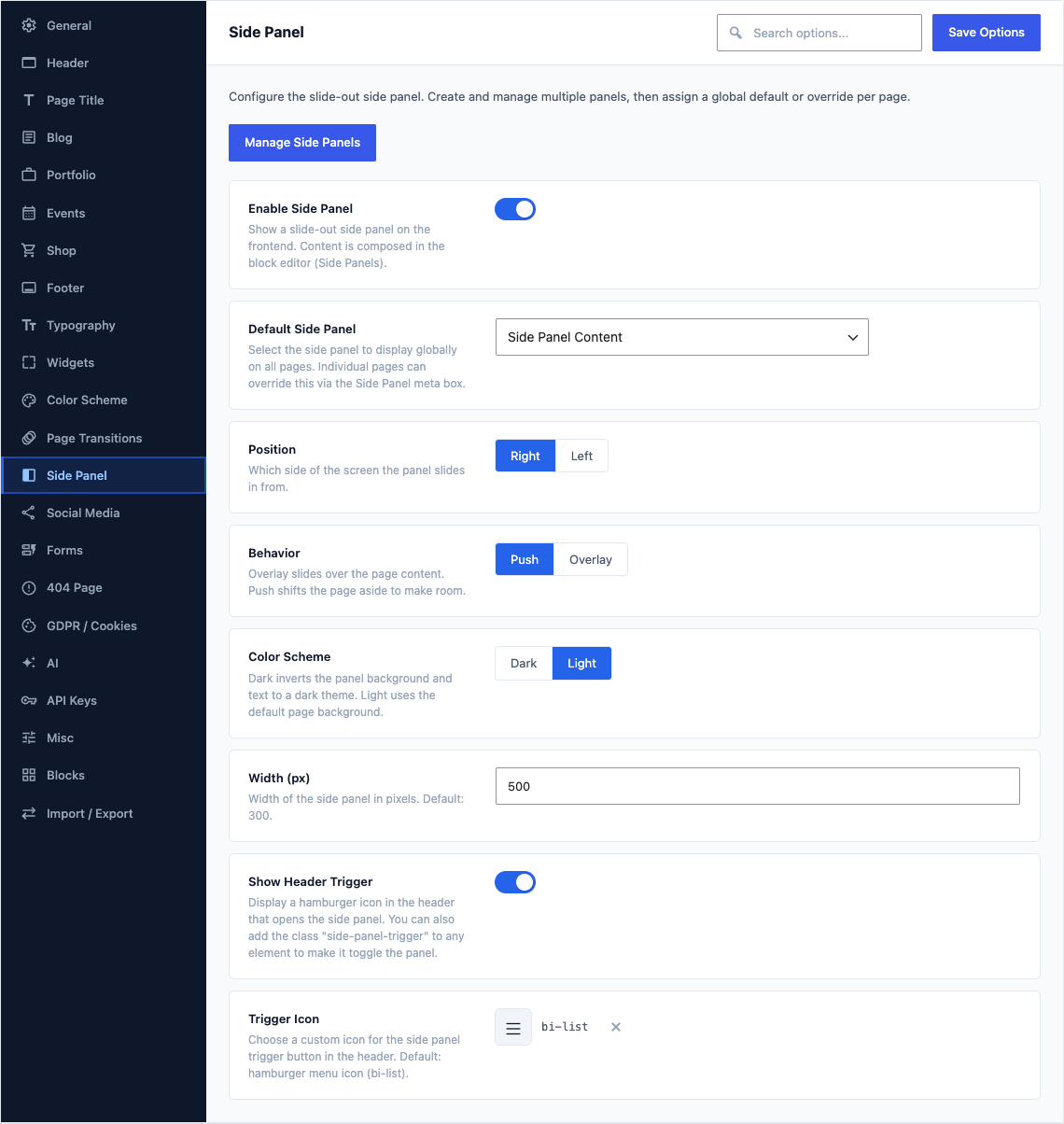
This group holds the following settings:
Enable Side PanelDefaultOff
Show a slide-out side panel on the frontend. Content is composed in the block editor (Side Panels).
Default Side PanelDefaultEmpty
Select the side panel to display globally on all pages. Individual pages can override this via the Side Panel meta box.
Shown when Enable Side Panel is on
PositionDefaultRight
Which side of the screen the panel slides in from.
ChoicesRightLeftShown when Enable Side Panel is on
BehaviorDefaultPush
Overlay slides over the page content. Push shifts the page aside to make room.
ChoicesPushOverlayShown when Enable Side Panel is on
Color SchemeDefaultDark
Dark inverts the panel background and text to a dark theme. Light uses the default page background.
ChoicesDarkLightShown when Enable Side Panel is on
Width (px)Default
300Width of the side panel in pixels. Default: 300.
Shown when Enable Side Panel is on
Show Header TriggerDefaultOn
Display a hamburger icon in the header that opens the side panel. You can also add the class "side-panel-trigger" to any element to make it toggle the panel.
Shown when Enable Side Panel is on
Trigger IconDefault
bi-listChoose a custom icon for the side panel trigger button in the header. Default: hamburger menu icon (bi-list).
Shown when Enable Side Panel is on